
Accessible Design Lab
Designing for everyone, intentionally.
Why Accessibility Matters
Accessible design helps ensure that digital experiences work for as many people as possible. This site explores key accessibility principals through practical examples and design experiments. Topics such as color contrast, alt text, heading structure, keyboard navigation, captions and accessible forms demonstrate how thoughtful design choices can improve useability for everyone.
Accessible Color Contrast
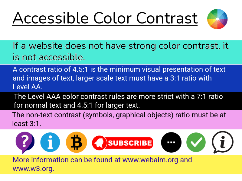
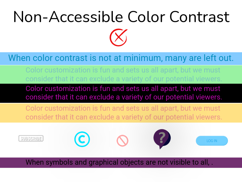
Color contrast helps ensure that digital content is readable for everyone. If the contrast between text and background colors is too low, words and interface elements can become difficult or even impossible to see. This especially affects people with low vision or color blindness, but it can also impact users in bright lighting or on smaller screens. Designing with strong color contrast helps create a more inclusive and useable experience for all.